LA GIOIA
/OVERVIEW
La Gioia was created to embody a particular kind of dining experience, one rooted in timeless Italian hospitality, refined atmosphere, and the quiet confidence of doing things well.
Inspired by Tuscany, the brand needed to feel classic without becoming predictable. The opportunity wasn’t to recreate old world Italy in a literal or overly nostalgic way, but to build a restaurant identity that honours tradition while still feeling fresh, elevated, and relevant in a contemporary setting.
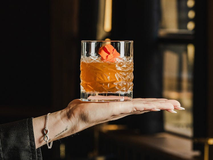
At its core, La Gioia is about more than food. It’s about mood, ritual, and the feeling of being looked after. Long lunches that become evening drinks, polished service that never feels stiff, and an environment where every detail feels considered. That sense of warmth and refinement became central to the brand direction.
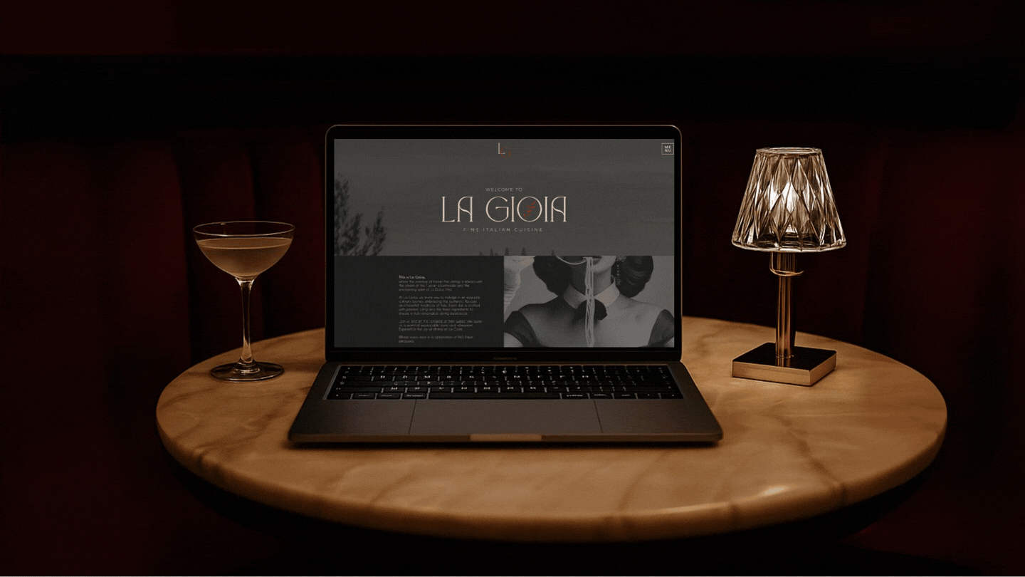
This wasn’t just about launching a restaurant with an elegant logo. It was about creating a full brand presence that could hold the emotional weight of the experience itself. Something that feels enduring, tasteful, and quietly memorable from the very first touchpoint.

/THE APPROACH
The strategy began by defining what kind of Italian restaurant La Gioia wanted to be. Not rustic in the casual sense, and not so formal that it felt distant. The sweet spot sat in between, a brand that feels steeped in tradition, but interpreted through a more contemporary lens.
That balance shaped the positioning from the outset. Tuscany became the emotional reference point, not through cliché visuals or overused heritage tropes, but through tone, restraint, and atmosphere. The brand needed to feel elegant, grounded, and generous. Sophisticated, but never cold. Premium, but still inviting.
From there, the identity was designed to reflect that same tension between heritage and modernity. The wordmark carries a graceful, refined presence, allowing the name to feel elevated without becoming ornamental. The olive branch motif adds a subtle nod to Italian roots, hospitality, and abundance, giving the brand a timeless symbol that feels both soft and assured.
The colour palette was developed to reinforce depth and permanence. Charcoal brings sophistication and structure. Wine red introduces richness, romance, and a sense of indulgence. Olive green grounds the identity in nature, tradition, and understated luxury. Together, the palette creates a world that feels classic, warm, and polished without relying on visual excess.
The broader system was designed to carry that mood across every brand touchpoint. Menus, signage, print materials, packaging, and digital presence all needed to feel cohesive and elevated. The goal wasn’t just consistency, but ambience. Every element had to support the same idea of refined hospitality and enduring quality.


/THE OUTCOME
La Gioia now feels like a restaurant brand with true presence. It doesn’t chase trend based hospitality aesthetics, and it doesn’t disappear into generic fine dining cues either. It feels distinct in a quieter, more confident way.
The strategy gives the brand its emotional foundation. The identity gives it recognition and atmosphere. Together, they create a brand world that feels elegant, intentional, and aligned with the level of experience the restaurant wants to offer.
Most importantly, La Gioia feels timeless. The visual language is refined without feeling rigid. The Italian influence is clear without becoming overdone. The result is a brand that captures both the romance of tradition and the polish of contemporary dining.
La Gioia proves that elegance doesn’t need to shout to be felt. When the strategy is clear and the identity is handled with restraint, a restaurant brand can feel deeply rooted, beautifully resolved, and built to last.