
KINDRED PLEASURE
/OVERVIEW
Kindred Pleasure had a very clear opportunity from the start. This wasn’t just about branding an online store selling intimacy products. It was about creating a brand that could completely change how that experience feels for women who are tired of the usual options.
In a category that so often leans either tacky, overwhelming, and hyper sexualised, or overly polished in a way that feels cold and detached, there was space for something more considered. More intimate. More refined. More human. Most of all, it needed to feel trustworthy. Not just in terms of product, but in tone, curation, and the overall emotional experience of buying.
Rachel’s vision became the anchor for everything. She wasn’t trying to create another loud pleasure brand or another crowded retailer with endless choice. She wanted to remove the overwhelm, elevate the category, and build a space where women could feel comfortable, seen, and quietly confident in what they were buying. That thinking shaped the strategy, identity, and overall direction from the ground up.

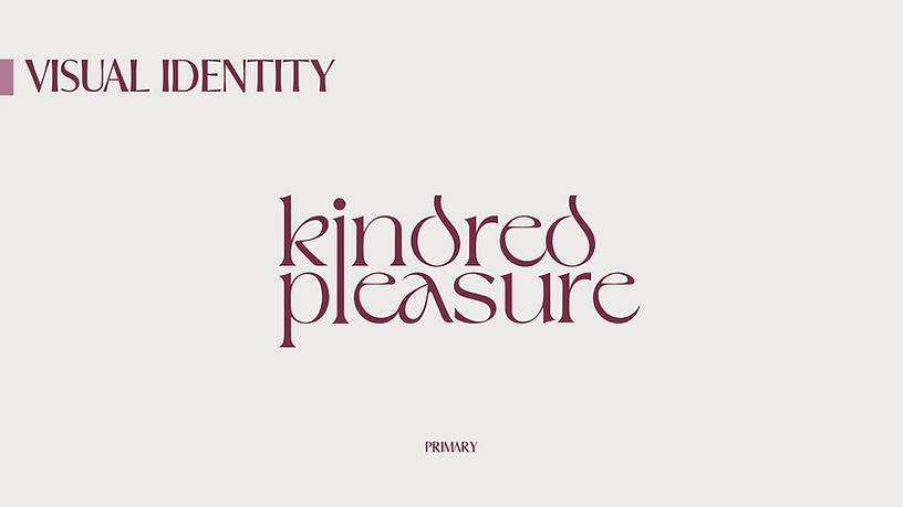
/THE APPROACH
The real challenge was restraint. This brand couldn’t afford to feel prudish or overly clinical, but it also couldn’t tip into the visual noise and garishness that still defines so much of the category. It needed to feel sensual without becoming performative. Premium without becoming cold. Feminine without becoming cliché.
That balance shaped everything. Strategically, the brand was positioned around curation, trust, and emotional ease. Rather than competing on volume or shock factor, Kindred Pleasure needed to feel like the trusted editor in the room. A place for fewer, better choices. A place where ethics, design, and discretion could sit together naturally.
Visually, I leaned into a softer and more elevated direction. Muted tones, warmth, and a sense of composure became key. The wordmark was custom built to carry meaning without becoming overworked. The extension of the i into the l of pleasure quite literally places the self within pleasure, while the linked d forms in kindred introduce a sense of motion, continuity, and feminine cyclical play. Together, those details gave the identity intimacy and distinction, while keeping the brand feeling calm and resolved.
From there, the wider system helped shape how the brand could live beyond the logo itself. Colour, type, supporting elements, packaging thinking, and photography direction were all considered through the same lens. The goal was never just to make it look beautiful. It was to make the whole experience feel more cohesive, more intentional, and more aligned with the woman it is speaking to.

/THE OUTCOME
The end result feels far more considered than the usual pleasure space. It doesn’t rely on cheap cues, visual overload, or obvious category tropes. It also doesn’t disappear into generic wellness sameness. There is a clear point of view to it now.
The brand feels refined, intimate, and emotionally intelligent. It gives Kindred Pleasure more than a visual identity. It gives the business credibility, clarity, and a sense of presence that supports where Rachel wants to take it next.
For me, this project is a strong example of how strategy can reshape an entire category experience. It shows that pleasure branding doesn’t need to be loud to be powerful. Sometimes the strongest thing a brand can do is create enough trust, beauty, and clarity for someone to feel instantly more at ease.


