
/The Edit
by Rhiannon Brock
/OVERVIEW
We began with brand strategy. The focus was to define how Rhiannon Brock, The Edit, should sit in the market, who it speaks to, and what makes the brand feel distinct beyond aesthetics alone.
At the centre of the positioning was the idea of curation as a service. Styling, in this context, isn’t just about clothing or visuals. It’s about taste, selection, refinement, and knowing what to leave out. That became the foundation for the messaging and brand tone. Quietly confident. Editorial without being cold. Personal without losing polish.
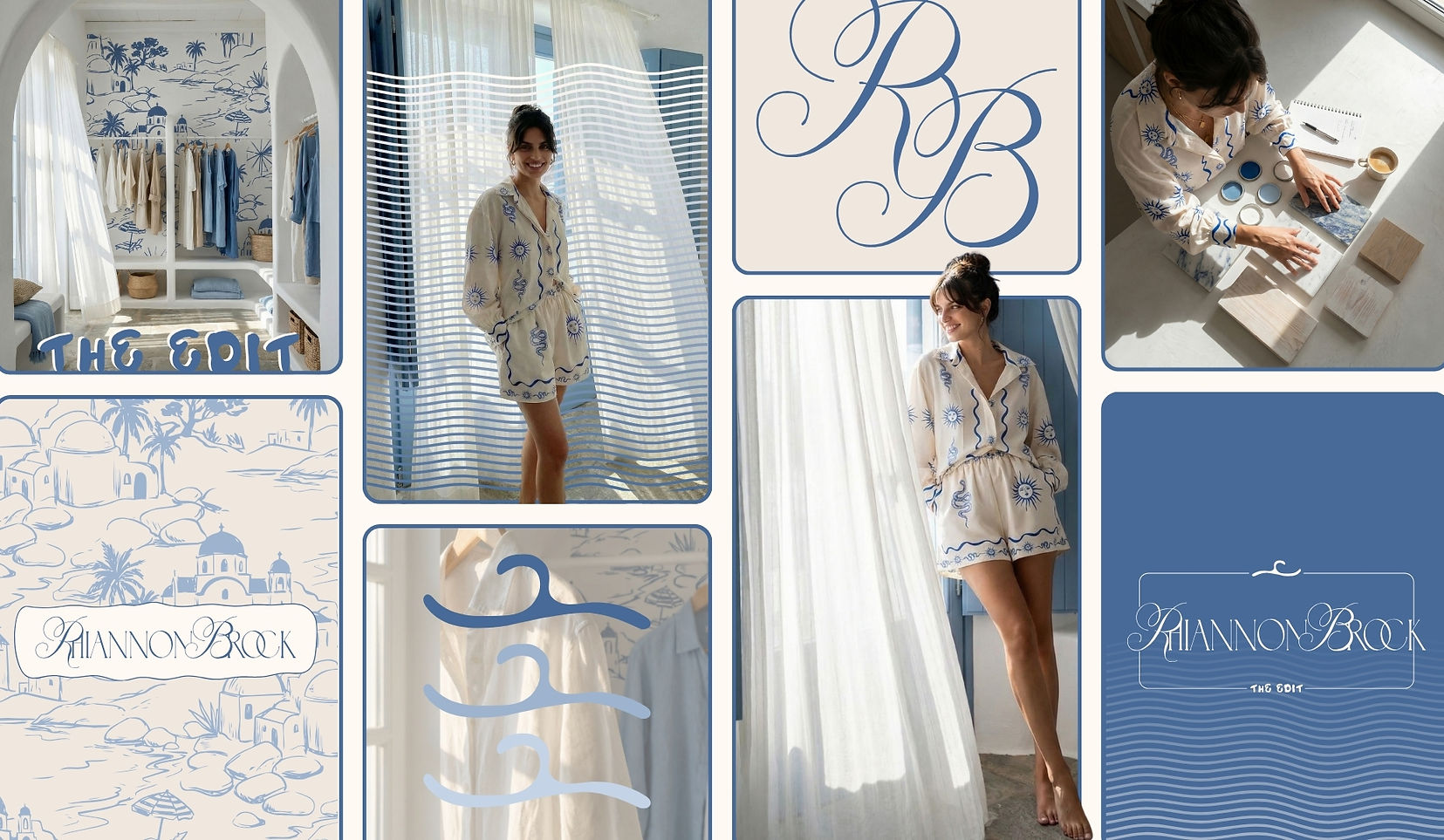
From there, the visual identity was developed to reflect that same balance. The typography feels elegant and high end, but not untouchable. The blue and ivory palette brings softness and freshness, while still feeling timeless. The monogram adds a sense of authorship and recognition, giving the brand a signature element that can live across print, packaging, social media, and digital applications.
Supporting graphics were designed to expand the world of the brand. Custom pattern work, fine line detailing, and soft wave motifs bring movement and personality without overwhelming the system. The result is a visual language that feels both fashion led and lifestyle driven, with enough flexibility to carry across multiple touchpoints.
Alongside the identity, the asset suite was built to give the brand real depth. Rather than stopping at a logo and palette, the direction included a full brand system with supporting marks, brand motifs, layout principles, and content ready assets so the brand could show up consistently and cohesively from day one.


/THE APPROACH
We began with brand strategy. The focus was to define how Rhiannon Brock, The Edit, should sit in the market, who it speaks to, and what makes the brand feel distinct beyond aesthetics alone.
At the centre of the positioning was the idea of curation as a service. Styling, in this context, isn’t just about clothing or visuals. It’s about taste, selection, refinement, and knowing what to leave out. That became the foundation for the messaging and brand tone. Quietly confident. Editorial without being cold. Personal without losing polish.
From there, the visual identity was developed to reflect that same balance. The typography feels elegant and high end, but not untouchable. The blue and ivory palette brings softness and freshness, while still feeling timeless. The monogram adds a sense of authorship and recognition, giving the brand a signature element that can live across print, packaging, social media, and digital applications.
Supporting graphics were designed to expand the world of the brand. Custom pattern work, fine line detailing, and soft wave motifs bring movement and personality without overwhelming the system. The result is a visual language that feels both fashion led and lifestyle driven, with enough flexibility to carry across multiple touchpoints.
Alongside the identity, the asset suite was built to give the brand real depth. Rather than stopping at a logo and palette, the direction included a full brand system with supporting marks, brand motifs, layout principles, and content ready assets so the brand could show up consistently and cohesively from day one.

/THE OUTCOME
Rhiannon Brock, The Edit, now feels like a brand with a clear point of view. It doesn’t rely on trend based styling cues to feel current, and it doesn’t disappear into the sameness of soft luxury branding either. It holds a distinct presence.
The strategy gives the business clarity. The identity gives it recognition. Together, they create a brand that feels credible, aspirational, and ready to be experienced across more than one format.
Most importantly, the brand feels complete. The monogram, the palette, the custom illustrations, the supporting graphics, and the wider asset system all work together to create a world that feels intentional and memorable. Not just visually appealing, but strategically aligned.
Rhiannon Brock, The Edit, proves that personal brands don’t need to feel casual to feel personal. With the right strategy and a fully considered identity system, they can feel refined, recognisable, and built for longevity.
