top of page

/KUSHI BAR
/OVERVIEW
Kushi Bar started with a simple observation. Everyone knows sushi, but not everyone knows kimbap. Rather than correct people, the brand leans into the overlap. Familiar enough to feel approachable, different enough to be its own thing.
The concept reimagines Korean kimbap through a contemporary takeaway lens. Bold flavours, fast service, and an identity that doesn’t over-explain itself. Kushi Bar borrows the visual shorthand of sushi culture, rolls, chopsticks, takeaway bags, then quietly rewrites the rules beneath the surface.
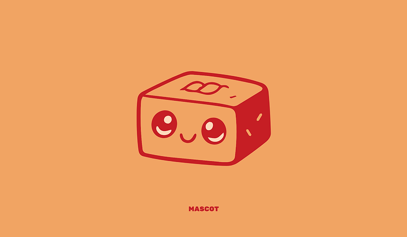
At the heart of the identity is a small mascot. A box-shaped kimbap roll that blends the food and the packaging into one simple character. Part roll, part takeaway box, it becomes a visual anchor for the brand, playful without being childish, memorable without needing explanation. It brings warmth and personality to the system while reinforcing the idea that this is food made to be grabbed, carried, and enjoyed.
The wider visual language mirrors that balance. Clean, graphic forms are paired with simplified line illustrations and soft humour. The palette stays restrained, allowing the mascot and messaging to carry the personality. Everything is designed to feel modern, confident, and instantly recognisable in fast-paced, real-world environments.
Kushi Bar isn’t trying to teach. It’s trying to feed people well. The brand speaks in short statements, lets the food do the talking, and understands that sometimes the best way to introduce something new is to make it feel familiar first.
At its core, Kushi Bar is about flavour without ceremony. Good food, rolled tight, wrapped up, and taken away. No rules. No lectures. Just something you’ll want to eat before you get home.


bottom of page